Ghia
SERVICES: UX, UI
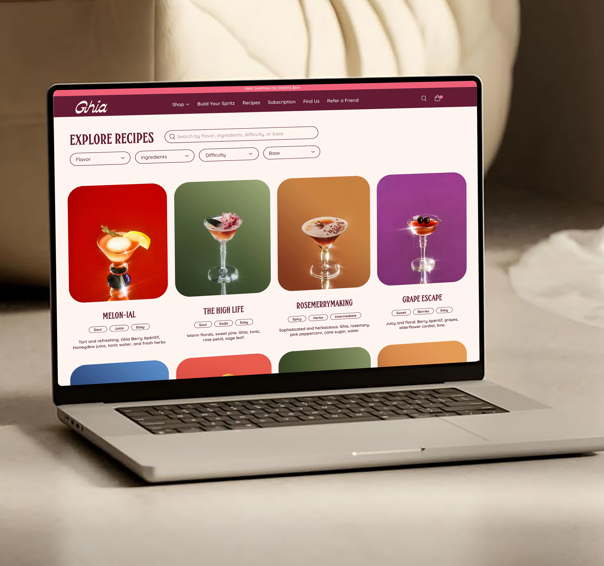
Responsive web re-design of Ghia’s recipe page complete with an added feature to make their non-alcoholic cocktails more approachable and accessible.


Introduction
Interest in non-alcoholic beverages is growing, but many potential customers lack the knowledge or confidence to use them. Ghia’s own research shows users often feel too intimidated to mix their aperitif, citing confusion around how to serve or pair it. This points to a larger gap in consumer education and approachability within the NA space.
Problem Space:
Many users don’t know how to mix or serve non-alcoholic cocktails.
Ghia’s research shows consumers feel intimidated by drink prep.
Lack of clear guidance creates hesitation at the point of use.
How might we make non-alcoholic cocktails easier to understand and more accessible to try?
Method: 7 one-on-one interviews with non-alcoholic drinkers
Goal: Explore perceptions, habits, and hesitations around non-alcoholic beverages
Key Themes:
Pain Points: Uncertainty around value, limited options, and drinks that feel too sugary or juvenile
Motivations: Craving flavor, variety, and elevated experiences, not just sobriety or wellness
Gaps: Lack of transparency around ingredients and how to use NA drinks with intention
Desire: More accessible, flavorful options that feel just as exciting as a cocktail
Stage 1: Discovery Interviews
"Sometimes there is no NA’s at certain spots...They don't offer that as much as you think."
"It's huge, because you want to have an idea of what you're getting into.”
"Not just juice, but actual health and wellness shots, fresh-squeezed juices, and really put-together mocktails."
"When I'm looking at something that has things like mint, raspberry…I'm more familiar with that than specific brands."
Method: Survey with 42 non-alcoholic beverage consumers (ages 25–40 majority)
Goal: Understand how users choose and engage with non-alcoholic drinks
Key Findings:
73.8% said interesting or new flavors matter most when choosing a drink
66.7% said the biggest challenge is the lack of options available
35.7% said they want to know the ingredients before trying a new drink
Stage 2: Survey on Non-alcoholic
User Personas
The users prioritize bold, interesting flavors and want clear descriptions, ingredient transparency, and guidance for how to enjoy the drink. While they’re motivated by wellness and avoiding hangovers, they still expect a premium experience
User Insights:
"I want a drink that feels special and exciting, not just a substitute for alcohol."
"I want my non-alcoholic drinks to feel something intentional, not an afterthought."
"I want drinks that support my goals and fit into my life without feeling like a compromise."
Design Audit
Before I started mapping out the design, I analyzed Ghia’s website for opportunities to improve on their existing experience and better accommodate their users.
The recipe page emerged as a key area with untapped potential to provide flavor discovery and make product use more accessible.
Identified pain points:
Recipes lack immediate context around flavor or ingredients, only listing the base product.
Navigation is limited to product categories, offering little support for exploration or decision-making.
The design prioritizes imagery over guidance, leaving users with minimal information to inform their choices
Existing design - Recipe Page
User Flow
My initial user flow explored an expansive discovery experience, offering multiple entry points and layered features to support user exploration. While it aligned with user motivations, it quickly became clear that the complexity wasn’t practical given the time constraints and lack of brand assets.
Initial Flow Focus:
Filters for mood, flavor, and effort to match varied user mindsets
Interactive recipe guides for step-by-step prep
Multiple off-ramps including share and explore loops
Checkout built into the exploration path
To make the experience more realistic and user-friendly, I scaled back and prioritized simplicity. I focused on what users said mattered most: flavor clarity, ingredient transparency, and easy recipes
Updated Flow Decisions:
Simplified filters to four core inputs: base, flavor, effort, and ingredients
Removed interactive recipes due to asset and time constraints
Refined the layout to reduce decision fatigue and guide users quickly to a recipe
User Flow 1 - Recipe Page
User Flow 2 - Recipe Page
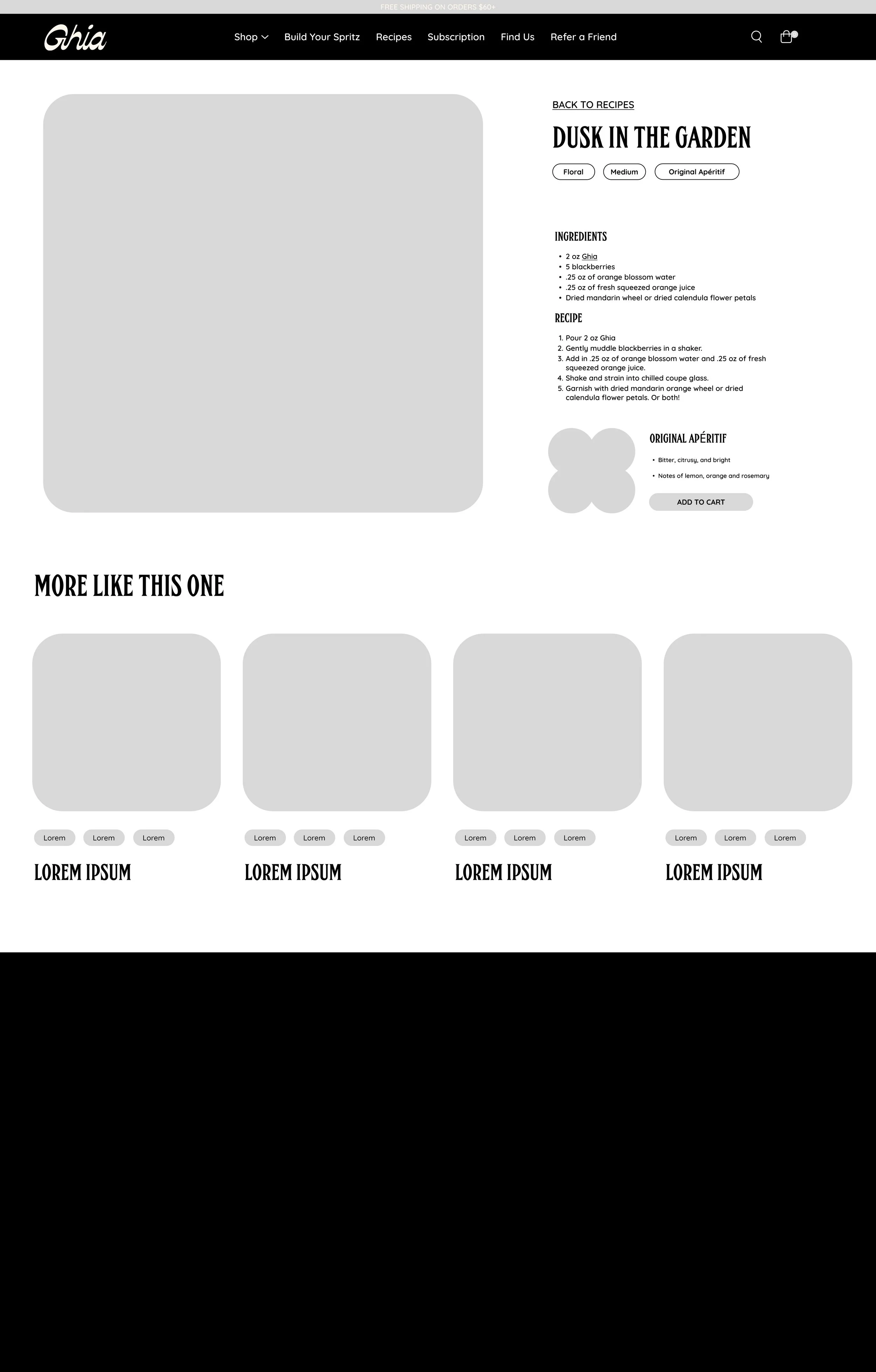
Wireframes: Mid to High Fidelity
Early wireframes brought the user flow to life by focusing on what users cared about most: flavor, ingredients, and ease. I implemented a filtering system and included clickable tags to help users make quick, confident choices.
Mid Fidelity - Recipe Page
Mid Fidelity - Drink Page
High Fidelity - Recipe Page
High Fidelity - Drink Page
What Worked
Clean Visual Design – Users praised the aesthetic and found it enjoyable to navigate
Filtering Felt Effective – Filters helped users explore confidently and find drinks that matched their preferences
Tags Encouraged Exploration – Clickable tags were seen as a helpful way to discover more recipes
What to Refine
Tag Behavior Was Confusing – Some users didn’t realize tags led to filtered results and were surprised by the redirect
Add to Cart Lacked Visibility – The button was mistaken for a text field and needed stronger visual hierarchy
Recipe Cards Could Use Small Adjustments – Users suggested spacing, a description, and hierarchy tweaks for clarity
Final Prototype
Following usability testing, several updates were made to improve clarity, usability, and user confidence throughout the experience
Key Changes:
Introduced a sensory, looping hero video on the landing page to create a more immersive and engaging entry point
Adjusted spacing on recipe cards to improve readability and visual balance
Moved drink titles above the tags to reduce confusion and improve scan-ability
Added short recipe descriptions to support quicker, more confident discovery


