Native
SERVICES: UX, UI, Graphic Design
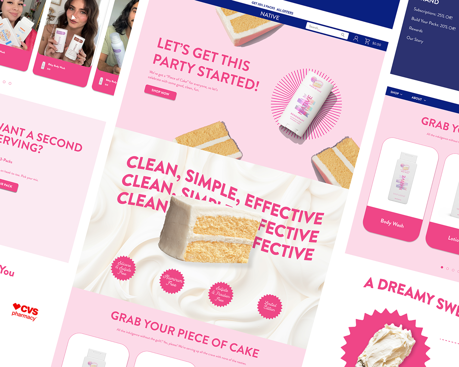
Landing page designed to launch a special collection for Native’s 10th anniversary with the aim to drive conversion through every touchpoint.


Introduction
I was brought on to design a landing page that felt playful, sensory, and shoppable. The goal was to move beyond static storytelling and create an experience that captured the indulgent, lighthearted spirit of the scent while staying true to Native’s clean aesthetic.
Project Overview:
Tools: Figma and Shopify
Deliverable: Landing page
Timeline: 1 week
Competitive Analysis
Dove: Excels in education and accessibility but lacks niche appeal and variety in sensory experiences.
Method: stands out for clean, effective personal care with a gender-neutral focus but lacks ingredient transparency.
Opportunities for Native:
Ingredient transparency
Playful, immersive storytelling,
Bold, sensory-driven design.
Heuristic Analysis
Native inquired about a website analysis with potential for a full redesign. I used insights from that audit to inform the new landing page.
Areas to Improve:
The layout is outdated and could benefit from more dynamic elements like interactivity or personalized shopping features to feel current
Some sections feel cluttered and would benefit from better padding to improve readability and flow

Feature Roadmap
We defined the feature set by looking at past Native landing pages, competitor best practices, and key expectations from the client.
While conversion was the primary goal, there were also secondary priorities around building awareness, encouraging engagement, and driving advocacy.
The page needed to feel clear, fun, and easy to shop. Every feature chosen helped tell that story in a way that felt purposeful and on brand.

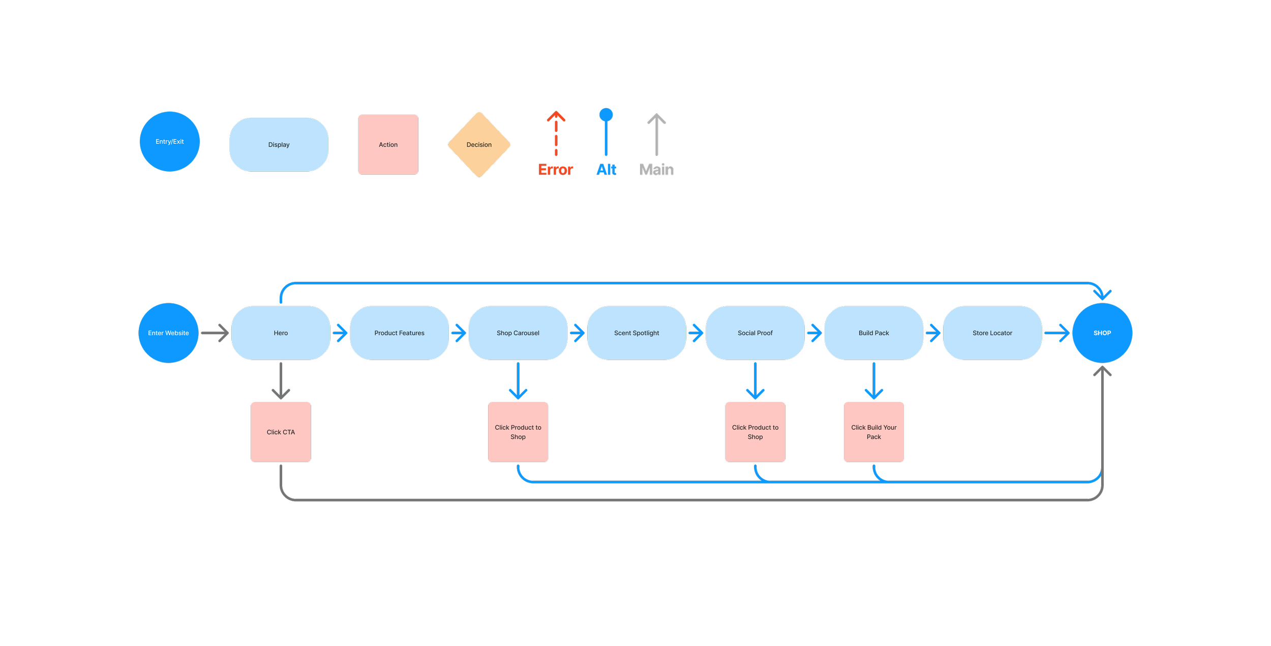
User Flows
The flow was designed to drive conversion through multiple entry points, making it easy to shop at every stage of the experience. From the hero CTA to product carousels, social proof, and even the bundle builder, each section includes a clear and clickable path to purchase.
This multi touch approach gives users flexibility in how they explore while keeping the ultimate goal of shopping front and center.
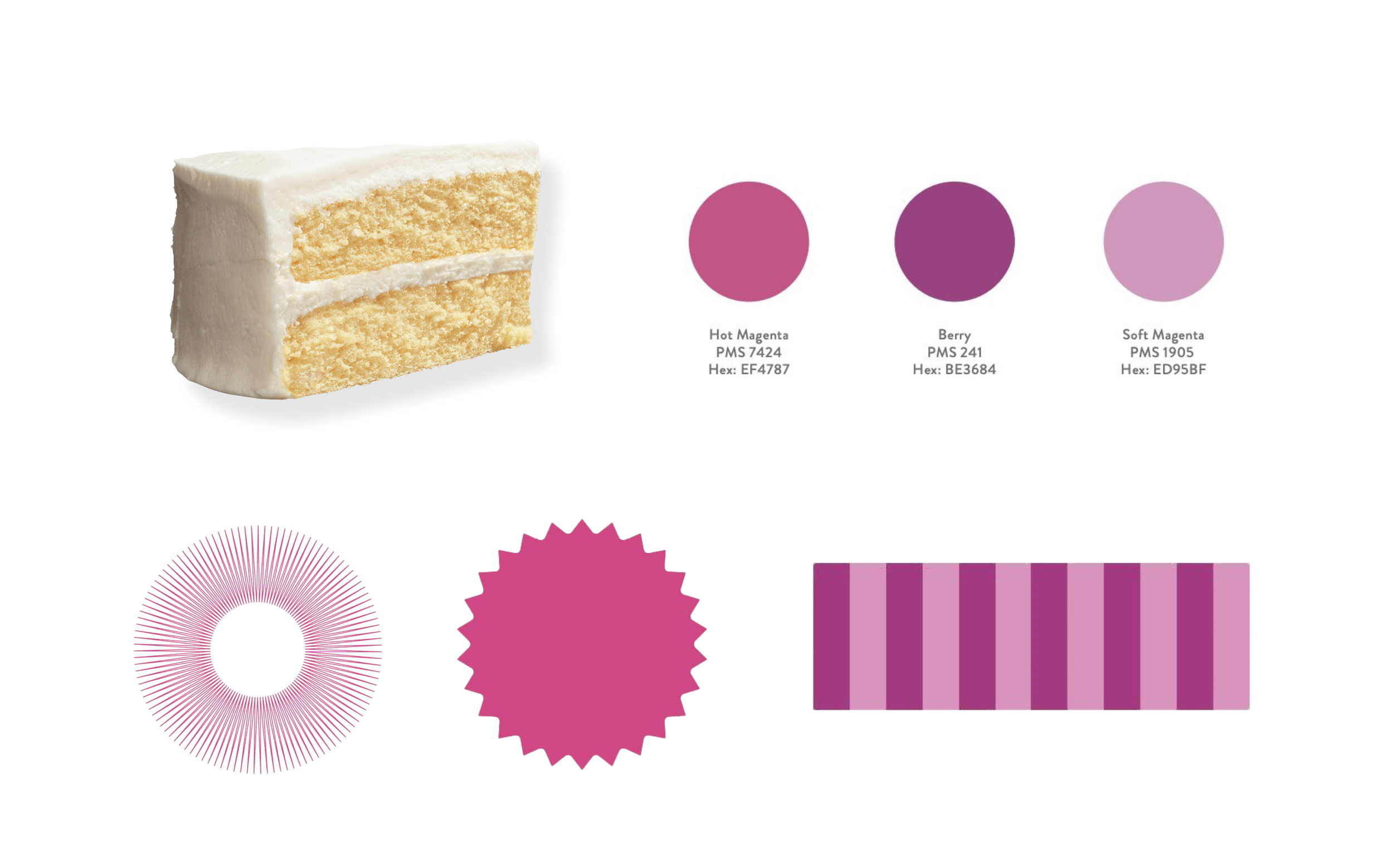
Campaign Identity
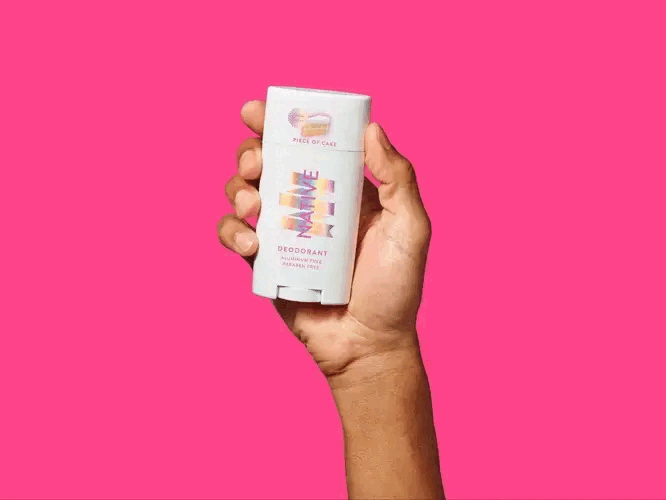
Bold, saturated pink hues, iridescent textures, and graphic shapes.
Cake imagery as both a metaphor and sensory element.
Leans into whimsical indulgence and bakery aesthetics.

Moodboard
Key Elements
Wireframes: Mid to High Fidelity
The client preferred to jump straight into high fidelity, so we relied on internal feedback to guide early iterations and ensure we stayed aligned with both brand and business goals.
Mid-Fidelity Feedback:
Product features weren’t prominent enough
Copy-heavy layout felt overwhelming, especially on mobile
Brand elements needed to be more visually present
Not enough shoppable touchpoints to drive conversion
Font sizes and spacing needed refinement to match brand standards
High-Fidelity Feedback:
Visuals felt too safe and lacked the brand’s playful tone
Needed more CTAs and a smoother, more dynamic shopping flow
Missing bold, sensory visuals and a clear scent-driven narrative
Each round of feedback helped shape a more immersive, engaging experience, balancing Native’s clean aesthetic with interactive moments and stronger storytelling.
Final Prototype
The final version brought the experience to life with richer visuals, stronger storytelling, and more ways to shop.
Key Changes:
Sensory elements and layered textures were added to create a more immersive, interactive feel that matched the indulgent vibe of the scent
A store locator was integrated to support last-minute client priorities and make in-store shopping more accessible
Hot pink became the hero color of the page, amplifying the campaign’s celebratory tone and adding a bold, energetic pulse throughout the design