
Thryve
SERVICES: UX, UI, AI Design, Branding
End to end app that transforms women’s nutrition, with tailored meal guidance and intuitive insights, giving users personalized guidance to cycle syncing.

Introduction
Hormones affect more than just periods, they shape our daily lives. But most tools don’t support the big picture. Let’s explore why this matters.
Problem Space:
The menstrual cycle affects mood, energy, cognition, and productivity
Hormonal fluctuations cause a variety of symptoms that impact daily life
Most existing tools don’t fully address hormonal needs.

How might we help women accommodate their symptoms during hormonal fluctuations?
Stage 1: Discovery Interviews
Method: 7 one-on-one interviews with women aged 22–40
Goal: Understand how users currently manage their hormonal health and what challenges they face
Key Themes:
Pain Points: Mood swings, migraines, cramps, cognitive fog, digestive issues
Tools Used: Journaling, apps, supplements, nutrition, exercise
Motivations: Want more balance, predictability, and control
Gaps: Lack of trusted guidance tailored to their body
"Just being aware of where I am in my cycle can help make the symptoms feel more predictable"
"As other parts of my life got healthier... I could tell, like, Oh, this is a hormonal issue"
"I was exercising every day. I was super nutritious. I was meditating, journaling"
"I just gotta do it holistically, because I have a lot of distrust in western medicine."
Stage 2: Survey on Hormonal Wellness
Goal: Validate patterns from interviews at scale
Key Findings:
61% use tools or trackers for hormonal wellness
61% named nutrition as their preferred method of management
55% want more education and cycle-specific guidance
How do you currently manage your hormonal well-being?
Stage 3: Survey on Cycle-Syncing with Nutrition
Method: Survey with 79 participants - Women in the cycle syncing community (ages 25–34 majority)
Goal: Dive deeper into how users connect nutrition with hormonal wellness
Key Findings:
76.9% find meal suggestions the most helpful for cycle syncing
65.4% feel too overwhelmed to track everything
62% report having regular cycles
Which of the following would you find helpful in a nutrition + hormone health tool?
Feature Roadmap
I used my new data to prioritize new and refined features:
Meal Suggestions Based on Phase
Personalized meal recommendations that align with each phase of the menstrual cycle.
Weekly Nutritional Focus
Highlights key nutrients to prioritize each week based on where the user is in their cycle.
Explore Tab to Search Meals by Mood/Symptom/Phase
A discovery tool that lets users search for meals based on how they feel, specific symptoms, or cycle stage.
User Personas
The users felt overwhelmed by general hormone advice and wanted practical, phase-specific support they could trust and actually use.
User Insights:
“I want to feel prepared and empowered.”
“I’m tired of masking symptoms; I want a routine that actually works.”
“Health is about harmony, not just symptom management”
User Flow
After analyzing Phase 3 survey data, it became clear users wanted more intuitive and personalized guidance without feeling overwhelmed. The following updates reflect how those insights shaped each feature in version 2.
Feature 1: Meal Plan
R1: Users had to select symptoms or mood first before seeing suggestions
R2: Prioritized phase-first filtering, with optional mood or symptom refinement
Why: Most users preferred meal suggestions based on their cycle phase and wanted quicker access without extra steps
Feature 2: Cycle Focus
R1: Displayed broad symptom categories
R2: Refined to show targeted nutrient focuses based on specific symptoms
Why: Users wanted clearer education and direction, not generic insights
Feature 3: Log
R1: Included multiple input options with detailed tracking
R2: Simplified to highlight energy, mood, cravings, and flow
Why: Many users felt too overwhelmed to track everything and needed a more lightweight way to stay consistent
Feature 4: Sign Up / Onboarding
R1: Collected detailed preferences upfront
R2: Shifted to progressive personalization after sign up
Why: Users wanted flexibility and less friction at entry
User Flows - Version 1
User Flows - Version 2
Brand Identity
Rooted in balance and nourishment, Thryve’s brand identity fuses organic forms and earthy tones with a peach inspired logo that symbolizes renewal, vitality, and the cyclical nature of hormonal health. The design system is designed to feel both grounding and up-lifting.

Moodboard - Look and Feel

Style Tile - Color, Font, Logo
Wireframes: V1 Mid to High Fidelity
User testing revealed key refinements: streamlined navigation, clearer onboarding, and improved terminology, ensuring a seamless transition from symptom tracking to actionable wellness solutions.
Mid Fidelity Prototype - Version 1: Dashboard, Cycle, Nutrition Plan, Explore, & Meal
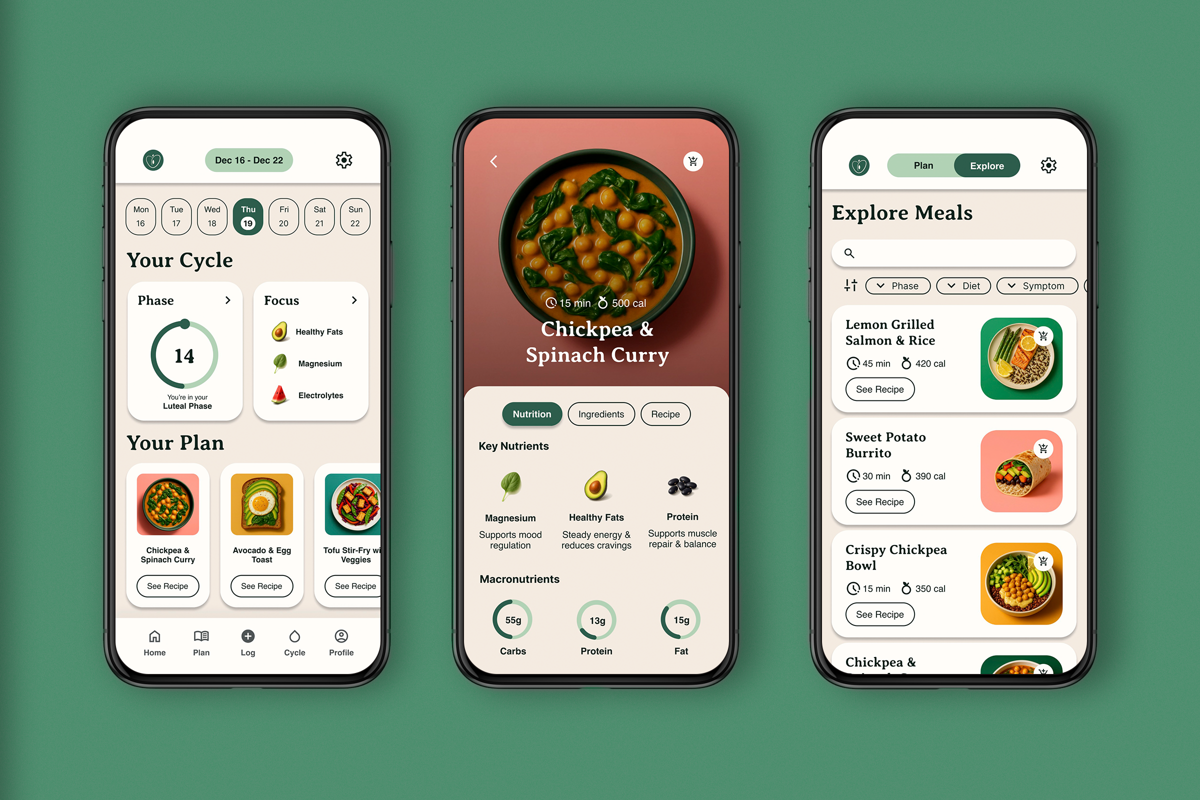
High Fidelity Prototype - Version 1: Dashboard, Cycle, Nutrition Plan, Explore, & Meal
What Worked
Clean & simple UI: Users praised the clean, well-structured interface that felt easy to navigate.
“Log” feature felt essential: Users found it easy and intuitive to track symptoms.
Meal suggestions were clear: Most users felt the meal plans were actionable and easy to understand.
“Explore” tab was highly valued: Users enjoyed filtering meal options based on preferences.
What to Refine
The relationship between cycle and nutrition wasn’t always clear: Some users expected a clearer representation of their hormonal wellbeing.
“Meal kit” terminology was confusing: Users suggested renaming it to something more intuitive.
Grocery list lacked function: Users needed better guidance on how it worked.
First-time users wanted more onboarding – Some users suggested a brief walkthrough upon opening the app.
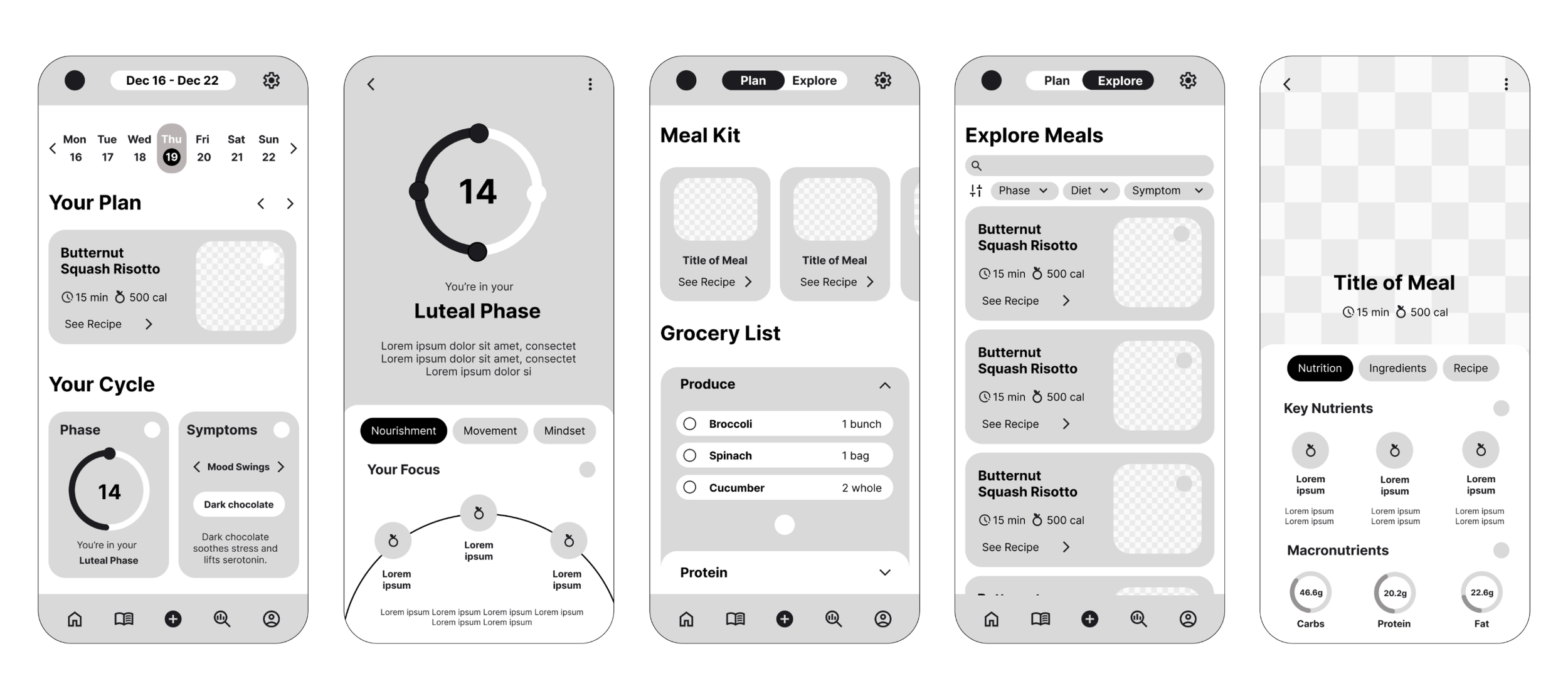
Wireframes: V2 Mid to High Fidelity
User testing and extended research revealed key refinements: streamlined onboarding, and improved features to provide better cycle-based guidance and ensure a seamless transition from tracking to actionable wellness solutions.
Mid Fidelity Prototype - Version 2: Phase, Focus, & Onboarding
High Fidelity Prototype - Version 2: All Features
What Worked
100% of users were able to complete the core tasks with no blockers
The interface clearly communicated how to access and explore the recipe suggestions
Users felt positively about the tone, aesthetics, and overall concept of the app
Initial onboarding was smooth and understandable for most participants
What to Refine
24% of users felt unsure about how to use the guidance for effective cycle syncing
Some confusion around top tab navigation, particularly between “Phase” and “Focus”
Terminology like “Focus” lacked clarity and caused uncertainty about the content
A few users flagged mismatched terminology in the birth control question
Following usability testing, several updates were made to improve clarity, usability, and user confidence throughout the experience:
Added a chevron icon on dashboard modules like “Prototype” and “Focus” to signal interactivity more clearly
Increased the size and visibility of the top tab navigation for easier discovery
Updated the birth control onboarding copy to better distinguish hormonal from non-hormonal methods, addressing user confusion
Introduced an overview section within each Focus module to highlight the nutritional benefits and motivate user engagement
Swapped the original logo icon for a more legible version, improving brand clarity at smaller sizes
Replaced the peach color with a stronger primary variation to enhance accessibility and contrast
Final Prototype
Takeaway
This project taught me the power of iteration and how returning to research and refining based on real user feedback can truly elevate both the design and the experience.
Next Steps:
Define how and where the platform’s content will be sourced
Build a beta version using a no-code tool or with a developer partner
Conduct usability testing to validate the final prototype