Thryve
SERVICES: UX, UI, AI Design, Branding
End to end app that transforms women’s nutrition, with tailored meal guidance and intuitive insights, giving users personalized guidance to cycle syncing.


Introduction
Hormones affect more than just periods, they shape our daily lives. But most tools don’t support the full picture. Let’s explore why this matters.
Problem Space:
The menstrual cycle affects mood, energy, cognition, and productivity
Hormonal fluctuations cause a variety of symptoms that impact daily life
Most existing tools don’t fully address hormonal needs.

How might we help women accommodate their symptoms during hormonal fluctuations?
User Personas
Women felt stuck between information overload and lack of personalization, struggling to align their habits with their cycles.
They wanted clear, phase-specific strategies to help regulate symptoms in a way that was simple, science-backed, and easy to integrate into daily life.

61%
Said they use tools, apps, and/or trackers to manage their cycle
61%
Said Nutrition was their preferred method of hormonal wellness
55%
Said they need more info on their cycle with detailed guidance
Design
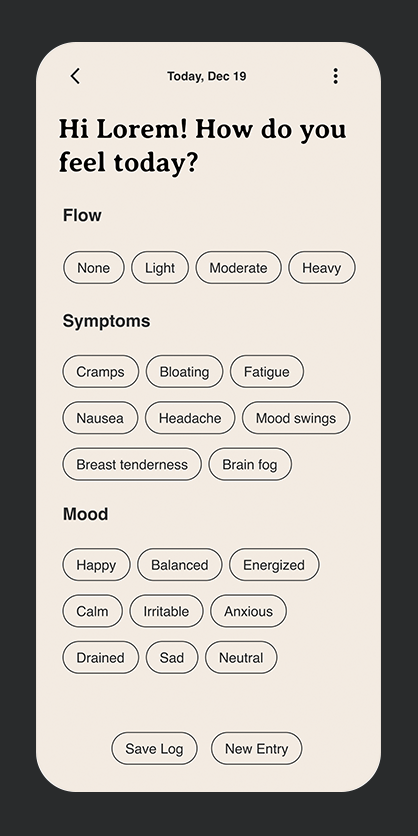
Early wireframes and user flows focused on reducing friction, ensuring that symptom tracking naturally led to personalized guidance—turning complex data into simple, actionable steps.

User Flow - Nutrition Recommendations
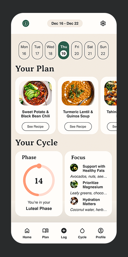
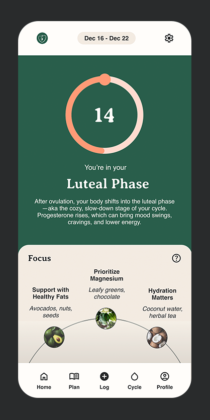
Mid Fidelity Prototype - Dashboard, Cycle, Nutrition Plan, Explore, & Meal
Brand Identity
Rooted in balance and nourishment, Thryve’s brand blends organic forms, earthy tones, and a peach-inspired logo—symbolizing renewal, vitality, and the connection between food and hormonal wellness.

Style Tile - Thryve Mobile App
Logo Design - Thryve
High-Fidelity Wireframes
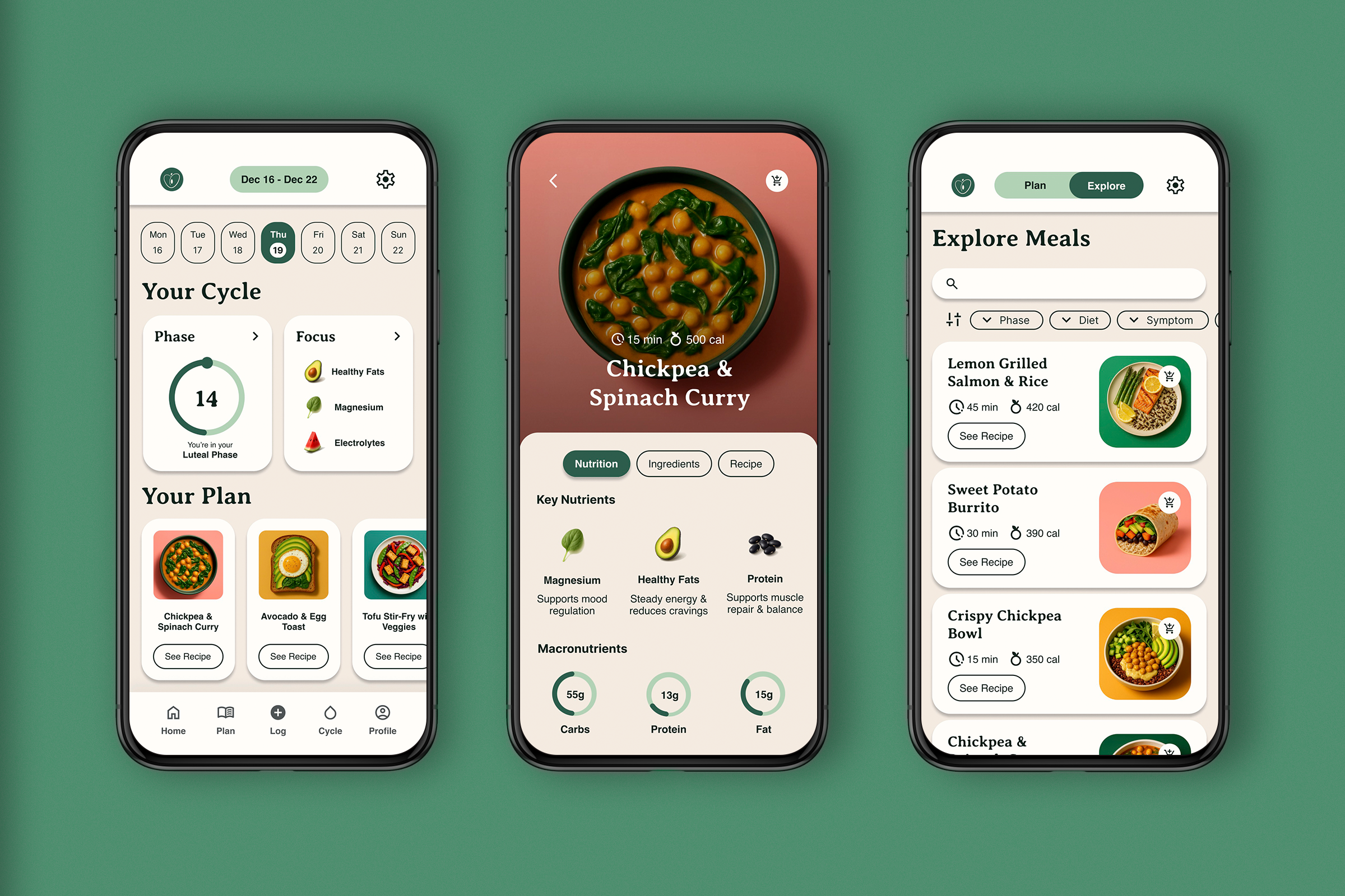
The high-fidelity prototypes transformed insights into an intuitive experience, refining interactions and visual hierarchy to balance personalization with clarity.

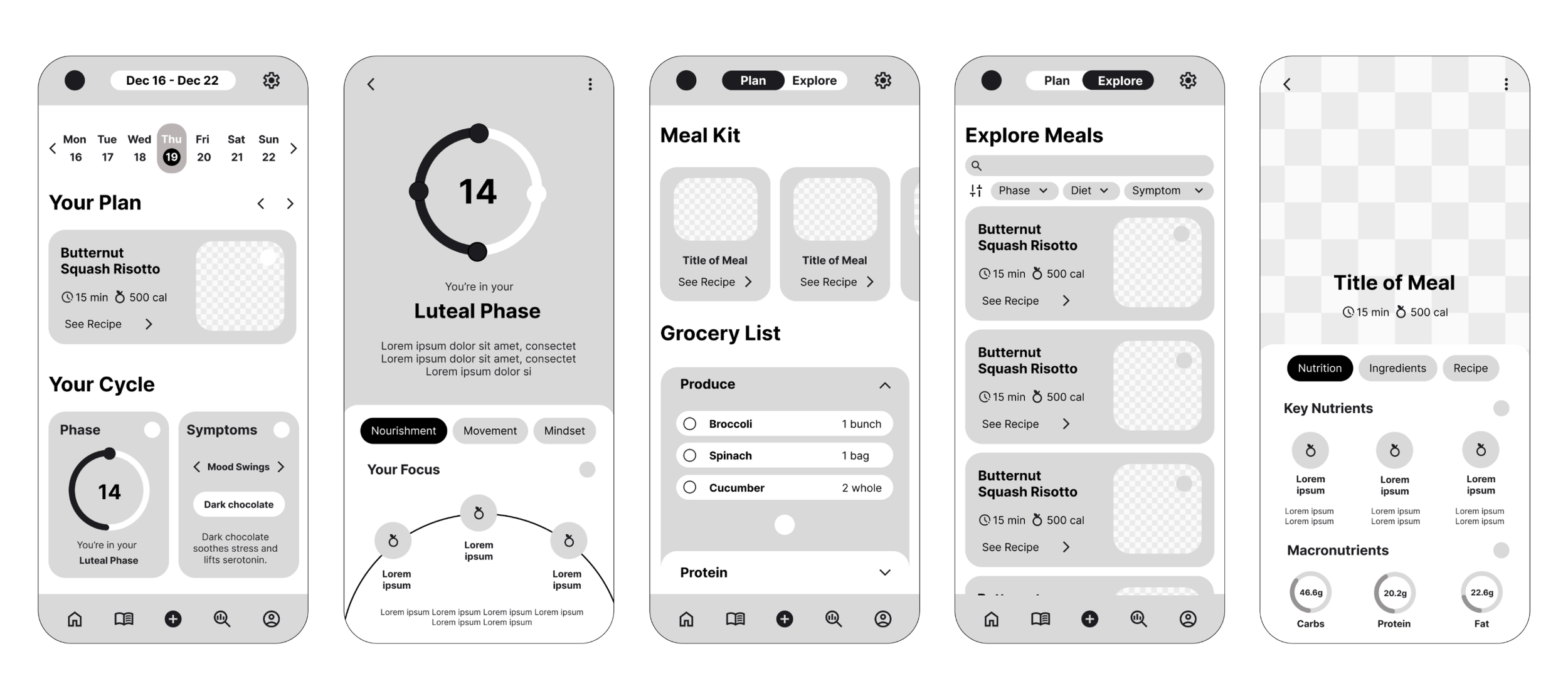
High Fidelity Prototype (R1) - Dashboard, Cycle, Nutrition Plan, Explore, & Meal
WHAT WORKED
Clean & Simple UI – Users praised the clean, well-structured interface that felt easy to navigate.
Log Feature Felt Essential – Users found it easy and intuitive to track symptoms.
Meal Recommendations Were Clear – Most users felt the meal plans were actionable and easy to understand.
Explore Tab Was Highly Valued – Users enjoyed filtering meal options based on preferences.
WHAT DIDN’T
Navigation to the Log Wasn't Always Clear – Some users expected to access it from the calendar picker.
Meal Kit Terminology Was Confusing – Users suggested renaming it to something more intuitive.
Grocery List Function Lacked Clarity – Users needed better guidance on how it auto-populated.
First-Time Users Wanted More Onboarding – Some users suggested a brief walkthrough upon opening the app.
Final Prototype
User testing revealed key refinements: streamlined navigation, clearer onboarding, and improved meal kit terminology, ensuring a seamless transition from symptom tracking to actionable wellness solutions.